W Logo Ideas:
Logo | Description |
|---|---|

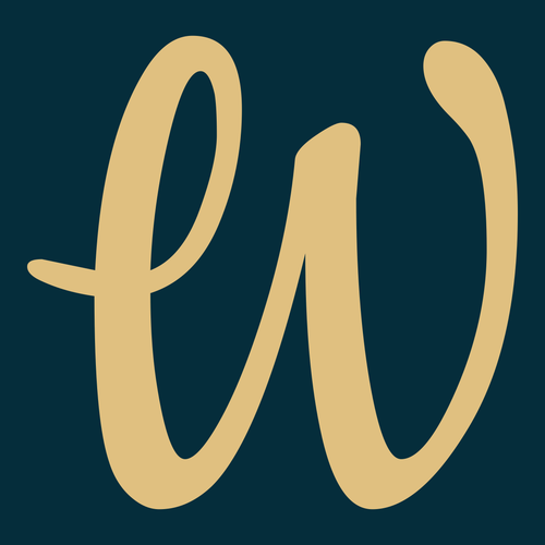
| The Cookie typeface has a style that resembles the ink from a fountain pen. This gives it a sense of class and distinction, while its elegant loops and flowing lines are swift and disarming. The color combination of navy blue and sandy brown has a premium feel and evokes a sense of sophistication. |

| The Cormorant Unicase typeface features intersecting lines that create a three dimensional illusion. It gives the "W" movement and dynamism, and the sharp serifs have a regality to them. The dark red color resembles a soft, velvety rose, and evokes a sense of romance and desire. |

| The Slackey typeface is a rulebreaker with no regard for design principles, yet the impression it makes on viewers is memorable. It is suitable for a brand with a rebellious and nonconformist identity. The dark gold color brings a sense of calm that acts as a foundation on which the craziness rests. |

| The violet color of this "W" imparts intelligence, curiosity, and creativity on the viewer. The Merriweather typeface is particularly curious for its combination of classy serifs and disproportionate linework. Its inconsistent stroke width is a playful twist on a classic design, making it memorable. |

| The blunt edges of the Changa typeface are noticeable on this "W," contrasting the sharp angles made by the letter. This creates an image that projects balance and order. The black and white color combination denotes professionalism and sophistication, suiting a brand with a bold presence. |

| The "W" on this logo calls the pages of a fashion magazine home. The elongated "legs" of the Anton typeface resemble that of a supermodel, and the geometry of the letter is sleek and stylish. This theme is extended by the teal background, which has a chic atmosphere and makes the white letter pop. |

| The combination of exaggerated swooshes and tidy serifs on the Cinzel Decorative typeface is unique and expressive. It creates a clever visual metaphor for balance, and suits a brand with a mantra of mixing work and play. The silver color seems to reflect light, giving it a premium feel. |

| Brown and white are colors that do not typically pair up, but they offer gorgeous contrast in this logo. Brown evokes earthy qualities, and white inspires a sense of divinity and nobility. The Sacramento typeface has lines that are thin and sleek, and its swirls suit a fancy and stylish brand. |

| Yellow is a fun and vibrant color that creates positive associations with viewers. It also works well to draw the attention of foot traffic in the vicinity of your business and make an impression. The Marcellus SC typeface is sleek and angular, lending itself to feelings of elegance and confidence. |

| The serifs on the Holtwood One SC typeface are bulky and catch the eye. They resemble pillar foundations and anchor the "W" to the ceiling. This gives the logo a presence that is synonymous with strength, while the black color conveys professionalism and imbues the letter with even more confidence. |


