Slime Logo Ideas:
Logo | Description |
|---|---|

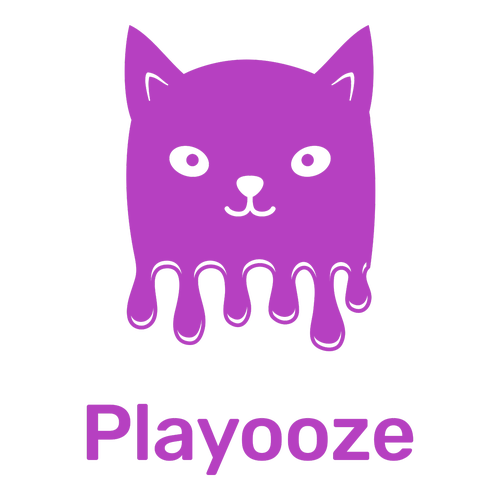
| The dark purple tone used in this design is a magical color that inspires the imagination, making it perfect for a slime business. The rounded corners of the Rubik typeface are friendly and inviting, while the attention-grabbing cat icon alludes to the type of business. |

| The simplicity and large size of this icon make it eye-catching, memorable, and appealing to children. The rounded elements of the icon and Dosis typeface convey a friendliness that will appeal to a youthful audience, while the soft blue color adds a sense of tranquility and depth to the design. |

| The bright pink color of this design is fun and energetic. It is complemented by the Permanent Marker typeface, which conjures amusing memories of drawing pictures (possibly on oneself) as a child. The cool slime monster icon plays on the idea of slime oozing between your fingers. |

| The bold orange color of this logo is a great choice for promoting toys as it represents happiness, creativity, and stimulation. The rainbow and stars icon is a fun, magical design that will appeal to children. The quirkiness of the slimy rainbow is complemented by the playful Baloo typeface. |

| A cute, youthful design that will appeal to very young children. The icon features a plush toy-like dinosaur against a blob of something that, at a stretch of the imagination, resembles slime. The yellow and green colors are fun and energetic. The chunky Slackey typeface is vibrant and lighthearted. |

| The solid background helps the design elements to pop, drawing attention to the splotch of ooze that is the icon. The icon is complemented by the Freckle Face typeface, which adds a playfully eerie effect. The lime green color is reminiscent of alien slime and would appeal to young children. |

| The soft, rounded elements of the Quicksand typeface complement the use of blue, which represents calmness and trust. The lack of an icon makes for a simplistic design, drawing attention to the business name. This is a restful design that promises a soothing experience. |

| The use of the Slackey typeface represents the slime element with its chunky, fun design that is great for displays. The squared shape of the text also lends an air of stability and dependability to your brand, while the smiling pink star icon adds a friendly vibe that should draw customers in. |

| The forest green color palette conveys a soothing sense of safety and balance, suggesting that you use organic products in your slime. The playful Lily Script One typeface is a clear, bold display font that adds a charming air to the design. Together, these elements create a striking effect. |

| The fun purple colors in this logo represent mystery, magic, and creativity, and are great for promoting children's products. The Eater Caps typeface is an unusual choice because it is a somewhat creepy, dark font, but the friendly character in the icon balances the design and adds a playful aspect. |


