Skincare Logo Ideas:
Logo | Description |
|---|---|

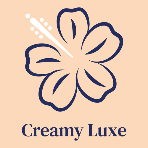
| A pretty logo featuring a delicate flower as an icon, hinting that your skincare line is fit for sensitive skin types. The DM Serif Text typeface is radiant in blue, a favored color that helps evoke feelings of trust and serenity. The splash of white in the icon adds to the complexity of the design. |

| Inspired by smooth, hand-lettering artist brochures from the 1950s, the Sacramento typeface adds a touch of familiarity and elegance to this simplistic design. The flower, with its dainty lines and pop of tasteful, chic pink, creates an interesting contrast against the transparent background. |

| The green icon signifies health and wellness, while the blue Playfair Display typeface exudes confidence — excellent traits for those looking to start a natural skincare line. The subtle foliage in the icon add some authenticity to the design, especially if you're offering 100% pure products. |

| The contrast between the unique Quantico typeface and the delicate icon forms a modern logo that grabs your attention. The icon plays around with different colors while cleverly incorporating the profile of a person. The color palette is rich and diverse, communicating messages of health and purity. |

| The color pink carries connotations of happiness, tenderness, and playfulness — qualities that are all reinforced in this pretty design. Thanks to the vivid color scheme and versatile Poppins typeface, the placement of the icon above the business name draws the eye and generates a memorable logo. |

| A classic design that would look fantastic on skincare bottles and merchandise. Purple symbolizes royalty and luxury — qualities that will help your brand stand out and reach a mature target market. The Cardo typeface is the ideal addition for a brand that creates top-quality skincare products. |

| The broad strokes of the Playfair Display typeface and the vibrant background create a captivating logo that would look great on signage. The icon highlights the profile in a speech bubble, implying your brand is spoken about often. The hot pink color scheme completes the logo with a modern twist. |

| A beautiful choice that is simple yet elegant. Pink and green create a wonderful balance of tranquility and playfulness. The flower-inspired icon suggests that your products are made of natural ingredients. The delicacy of the DM Serif Text typeface enhances the idea of floral-scented products. |

| A logo design that relies heavily on the classic beauty of the Monsieur La Doulaise typeface, which was inspired by authentic hand lettering and calligraphy in the 1930s. The vivid yellow background immediately commands attention, making it perfect for merchandise and promotional material. |

| The beautiful icon is simple but tasteful, creating the perfect blend of elegance and modesty. The monolinear style of the Poppins typeface helps emphasize all the simplistic elements in the logo. The black and white color palette suit the logo's aesthetic perfectly, exuding class and purity. |


