Punk Logo Ideas:
Logo | Description |
|---|---|

| An abstract skull wearing headphones makes for a great punk band logo. The Ubuntu typeface is perfect for the punk aesthetic, because the term is used to express a wish for freedom and equality for all, while sky blue and magenta convey hope and universal harmony, softening this design tremendously. |

| Black and white creates a more sophisticated, professional palette that is contrasted by the keyboard icon where the keys shown in the reverse colors indicates a trend of rule-breaking and non-conformity. Meanwhile, the geometric styling of the Orbitron typeface adds a cool, futuristic aesthetic. |

| The sharp edges in this design convey the intelligence and power of this cool dragon icon. The dragon's sharp nose draws attention to the futuristic Cormorant Unicase typeface, which highlights the brand's innovative and forward-thinking style. Finally, dark cyan brings a sense of calm to the logo. |

| Bright red creates an eye-catching logo and, when combined with the skull, conveys a dangerous thrill of anticipation. The splatter effect behind the skull adds a grungy element to the design that is complemented by the grotesque-inspired letterforms of the Barlow typeface. |

| The ZCOOL XiaoWei typeface, with its graceful serifs, creates an attractive whimsy that suits the somewhat comical effect of the skull with records for eyes and an eye-patch, maybe hinting at the rebelliousness of pirated music. Yellow-orange reassuringly hints that the music is simply affordable. |

| A fiery demon is a great punk symbol, showing passion and a disdain for the rules. The appropriately named "Rebel," a dark taupe, conveys the stubbornness of a headstrong personality. The structured Monda typeface contrasts the fluid form of the icon and provides a strong platform for the brand. |

| Vivid pink makes a statement against this black background, highlighting a trendy, modern brand. The EKG line between the headphones sends the message "music is life" and is complemented by the bold curves of the retro Ceviche One typeface which enhances the dynamic aesthetic of this logo. |

| The vintage Federo typeface, adapted for maximum readability on screens, is perfect for an online brand. Shades of light blue against a darker background create an icy effect, chilling the viewer when combined with the spiked skull icon. This design tells competitors you are not to be messed with. |

| A cool monkey wearing sunglasses and possibly a pair of headphones would make a funky mascot for a punk music brand. The script-style of the Redressed typeface adds a personalized touch to the logo, resembling an autograph, while soft pink enhances the playful nature of the design. |

| The use of turquoise creates a calming effect that tones down the wildly flaming guitar, which proclaims your music is on fire — an interesting contrast of passion and peace. The refined letters of the Antonio typeface add versatility to the design suitable for small to large-scale marketing. |

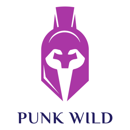
| The top of this helm resembles the mohawk most punks are famous for, creating a strong image. Meanwhile, magenta promotes the compassion, appreciation, and energy that punk is known for. The Philosopher typeface inspires introspection and universal acceptance, highlighting the punk aesthetic. |

| A splash of sunny orange against this stark logo design conveys enthusiasm and excitement about your brand. The gear and bolt elements hint at the urban stylings of punk fashion, while the friendly, rounded Ubuntu typeface symbolizes an open-minded brand that is accepting of all comers. |

| Vivid pink can be used by a punk brand to stand out from the competition and shine with a sassy personality. The bold Bebas Neue typeface puts the business name in the spotlight as one to be wary of. The rock 'n' roll hand symbol hints at a business in the music industry, with a focus on punk rock. |

| The business name takes precedence in this logo, standing strong in the bold PT Sans Caption typeface which highlights this brand's contemporary aesthetic. This idea is complemented by the tribal tattoo design, while the gray and black enhance the idea of tattoos as well as the modern vibe. |

| In this logo, the phoenix symbolizes the resurrection and immortality of a person's self-confidence, with the bright yellow-orange hinting at passion and flames. The tail leads the eye to the KoHo typeface, which combines humanistic and mechanical characteristics for a unique effect. |

| The vintage Special Elite typeface adds a bit of an inked-up grunge aesthetic that suits a punk theme down to the ground. The flaming skull adds to this effect and the skeletal grin seems to convey a sort of berserker joy. All of this is contrasted by bright orange, portraying positivity and warmth. |

| A business name will always shine in the classic Oswald typeface, which is perfect for online branding and marketing. Bright red also catches the eye and encourages customers to come into your store or use your services. A battle-hardened wolf conveys a brand message of understanding and loyalty. |

| A cool dark blue shines next to gray, conveying the authority, intelligence, and trustworthiness of your business. The geometric letters of the Changa typeface enhance the idea of your business being one customers can trust, and complement the sharp edges of the playful, punk music-inspired icon. |

| Bright red is an attention grabber that aids in brand memorability, while the sound bars shaped like a rock 'n' roll hand symbol highlights your brand's punk music aesthetic. The rounded Ubuntu typeface works well with the rounded shape of the geometric icon and adds a sense of welcome. |

| A game controller shaped like a bat hints at horror-themed games and accessories that will appeal to any cyberpunk enthusiast. A monochromatic black color palette makes a powerful statement and adds an intriguing sense of mystery, while the Lusitana typeface lends an epic vibe to your business name. |


