Massage Logo Ideas:
Logo | Description |
|---|---|

| The Cinzel Decorative typeface is inspired by classic Roman inscriptions. The elongated, curving lines mimic the qualities of flexibility and are perfect for a massage logo. The color purple is used to appeal to mysticism and dreams, and is suited to this kind of business. |

| This icon, reminiscent of the tree of life, but using a spinal column as a tree trunk, is depicted in vibrant yellow and green colors. This gives clients the impression that they'll be renewed after a massage from you! The brown Josefin Sans typeface adds an elegance and grounds the bright icon. |

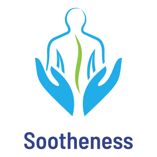
| Centered in this logo is the image of a light green spine supported by nurturing, therapeutic hands. The Barlow Semi Condensed typeface uses rounded lines that allude to flexibility. The combination of the light blue icon and the dark blue text creates a calming and professional impression. |

| This earthy, childlike design shows clients exactly what you do with the image of hands splashing oil on the background. The beautiful dark blue color suggests depth and calmness, while the Marcellus typeface balances the design with a refined beauty that's great for online and printed ads. |

| In advertising, the color blue can be used to convey feelings of calmness and trust. The Poppins typeface features rounded lines that are suggestive of flow and mobility. The floral icon may suggest a delicate touch and evokes tranquility, making it the ideal symbol for a massage practice. |

| The clean linework in this icon elegantly captures the nature of your massage practice. The three rocks highlight your unique methods and contribute a sense of balance to the design. The gold color highlights quality and pairs well with the smooth black lettering of the Marcellus typeface. |

| This logo features a human body in the shape of a badge. It's a creative way of telling customers that your business is serious about muscular health. The curved Barlow Semi Condensed typeface pairs well with the smooth linework in the icon, and the purple color palette is associated with quality. |

| The use of the Laila typeface adds a friendly, contemporary appeal to this logo, and makes it perfect for displays. The bold lines of the red text complement the more delicate brown lines of the floral icon, which brings to mind a calming, scented atmosphere – perfect for a relaxed massage parlor. |

| In advertising, purple is closely associated with dreams and mystery. The smooth lines of the white Barlow Semi Condensed typeface emphasize curves and flexibility. The green candle underscored by a sweeping leaf creates a natural connection and produces a calming effect in this design. |

| The icon of a flower over a pink bowl calls to mind the essential oils and diffusers used to create a relaxing atmosphere for massage clients. The pink color is echoed in the contemporary Laila typeface and adds a youthful, friendly vibe that will appeal to a younger client base. |


