M Logo Ideas:
Logo | Description |
|---|---|

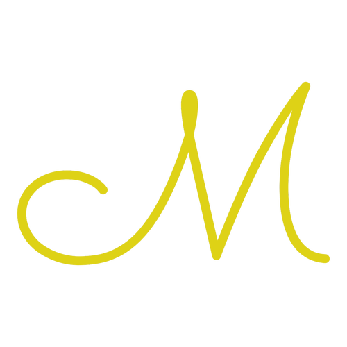
| A simple and elegant design is created through the sweeping curls and lines of the Sacramento typeface. The vivid yellow color of the letter evokes images of smiles and sunny days, conveying a brand message of hope and positivity. The transparent background makes for a versatile logo. |

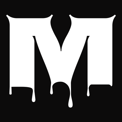
| With a dark background and ghostly white letter "M," this logo projects a gloomy, creepy atmosphere. This spine-chilling vibe is enhanced by the dripping Nosifer typeface. This striking logo grabs attention and would look great online in social media ads and printed on marketing materials. |

| This logo grabs attention with the Denk One typeface, created for use in any size and in both print and online mediums. Its handlettered style adds a personal touch, while the aluminum gray color suits a wide variety of business types, as it can be both sleek and high-tech, ornate and industrious. |

| A bright orange background will stop potential customers in their tracks and draw them to your business. It conveys joy, creativity, and determination — great characteristics for any business. The lack of serifs and the slightly rounded corners of the Rubik typeface are inviting and agreeable. |

| The smooth flowing curves of the Pacifico typeface show the surf culture inspiration of this text, conveying a laid-back, easy-going atmosphere. The sea-inspired typeface is balanced and enhanced by the naturalistic Amazon green color choice, communicating ideas of spring, rebirth, and renewal. |

| The minimalistic style of this black and white logo is simple and graceful, suiting a high-end business. This elegance is complemented by the Cinzel Decorative typeface, where the classical proportions of ancient Roman transcriptions have been moderated to add a contemporary edge to this logo. |

| This funky logo design uses the Special Elite typeface which, inspired by vintage typewritten texts, adds a grungy, old-school vibe. It is contrasted by the vibrant and happy sunflower yellow color, the brightness of which highlights your lettermark and will draw attention to your business. |

| The simple lines of the Autour One typeface make a statement in wine red. The straight lines of the typeface imply that your business is stable, strong, and professional, while the color adds a touch of ambition and grandeur. This combination of elements suits a high-powered business. |

| The cool blue-green background immediately conveys a sense of peace and calmness to viewers, and serves as the perfect backdrop to the pure white letter "M." The Monoton typeface has a retro '80s vibe but works well as a webfont, making this a great design for an online business. |

| Bright pink immediately catches attention and communicates a brand that is fun, playful, and approachable. It's a great color to stand out from the competition, as it's not often used in logo designs. The bold Anton typeface holds its own against the pink and makes for a great display typeface. |


