L Logo Ideas:
Logo | Description |
|---|---|

| The design's dark backdrop symbolizes style and power, illuminating the light pink color of the Forum typeface. With its classic proportions and sharp terminals, the typeface does a great job of conveying refinement and sophistication. This logo is ideal for a luxury clothing or beauty brand. |

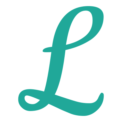
| The delicate linework of the Cookie typeface conveys a feeling of elegance, lending the design a timeless appearance. While not overly decorative, the typeface does a good job of expressing a sense of luxury that's hard to ignore. The sea green color adds a touch of friendliness to the logo. |

| Meaning "joyful" in Thai, the Pridi typeface is an eye-catching text choice with a modern edge. The strong stems and bold terminals of the "L" letterform are prominent in a dark blue color, which symbolizes power and stability. The light blue backdrop gives the logo a professional look. |

| The purple color of the "L" letterform symbolizes style and intrigue. These qualities are beautifully captured by the Parisienne typeface, known for its classic yet free-spirited appearance. The flowing linework brings a sense of elegance to the design, which will work well for a chic business. |

| The Gochi Hand typeface, inspired by teenage handwriting, has a solid yet playful appearance. With its slightly tilted style and rounded linework, the "L" letterform brings whimsy and fun to the design. The green color denotes freshness and vitality, adding a hint of naturalism to the logo. |

| Inspired by old style railroad posters, the Calistoga typeface has rounded corners, blunt serifs, and slightly bouncy strokes that blend together to create a prominent and attractive "L" letterform. The dark brown color accentuates the railroad theme of the text and adds a vintage touch. |

| The logo uses a gold color to symbolize wealth and refinement, hinting that your business caters to an upmarket clientele. Reminiscent of handwritten lettering, the Quando typeface features blunt terminals and slight curvatures that create a memorable and dynamic impression. |

| The El Messiri typeface has a modern, edgy look that's suited to a powerful and authoritative business. The "L" letterform's top serif is slightly curved, bringing its stem and stroke to life. The red backdrop is fiery and bold, while the pop of white conveys a feeling of freshness. |

| The friendly linework of the Mali typeface is enhanced by the vibrant orange color, which symbolizes joy, warmth, and freedom. As an interpretation of children's handwriting, the typeface exudes a feeling of whimsy and carefree fun, suiting a business that does not take itself too seriously. |

| Curved in shape and bold in style, the Marko One typeface packs a punch in a professional blue color. Its smooth inner corners and slightly rounded edges create a charming impression that's perfect for both online and print branding. It's a great logo for a business with a fun aesthetic. |
Logo Fonts — Complete Guide with Downloads


