Foundation Logo Ideas:
Logo | Description |
|---|---|

| The curves of the Rubik typeface contrast nicely with the angular form of the icon, which features outstretched hands to convey a sense of upliftment and collaboration. The dark monochromatic color scheme enhances the nightfall aesthetic, while its memorable appearance lends a contemporary twist. |

| This heartwarming icon sends a profound message about how a broken path in life can still lead you to safety and comfort. Perfect for a nonprofit center or shelter, this logo incorporates formal colors to appear smart and professional, while the dashing Cinzel Decorative typeface adds individuality. |

| Trees have often been associated with sanctuary. Whether you're looking for shelter from the rain or the sunshine, including this message of safety in your logo makes your brand appear kind and welcoming. The golden hue adds a touch of grandeur — themes echoed in the Forum typeface's elegant stems. |

| The clever use of negative space provides ample visual breathing room and creates the memorable visual of a family — complementing a foster home or care facility. While shades of purple speak to your ambition and creativity, the mild Rubik typeface builds on the logo's approachable quality. |

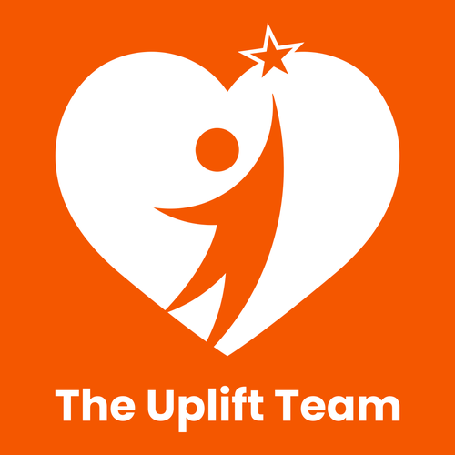
| The Poppins typeface is modest but firm, balancing the curves of the heart-shaped icon. While the dark orange tone imbues the design with intrigue and excitement, the image of a figure reaching for a star denotes hope and the theme of accomplishment, suiting a company that wants to inspire others. |

| With its bold, elegant letters, the Cinzel typeface holds space well beneath the circular icon, which adds a pop of energy with its sunny green hue. The hands stretching across the icon represent hope for individuals in need of support, while the earthy tone of the business name grounds the design. |

| The logo's formality stems from the classic Noto Serif typeface and modest color palette, which includes grayish-blue to support the design's notions of maturity. The figure sprouting from hands highlights the caring attitude of your foundation, while the leaves allude to an appreciation for nature. |

| The sun cresting the horizon denotes optimism, suiting a foundation that wants to uplift communities. The simple, straightforward letters of the Barlow Semi Condensed typeface allow the striking icon to take center stage, while the pink and blue-purple colors symbolize compassion and creativity. |

| Blue is a professional color that's dependable and versatile, matching a foundation that wants to expand and earn its supporters' respect. The little hearts escaping the chimney radiate with compassion and kindness, while the quirky Ranchers typeface helps lend whimsicality to the foundation name. |

| While the Jomolhari typeface appears traditional and official, the youthful orange tone contrasts these themes by introducing excitement and ideas of adventure. The hands reaching for the heart is a compelling visual identifier that will make a statement on your foundation's banners and uniforms. |


