E Logo Ideas:
Logo | Description |
|---|---|

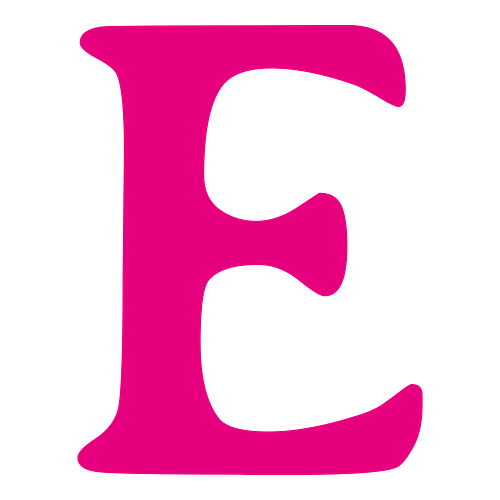
| This design uses a pink color to create a chic and charming image, enhanced by the cartoonish lettering of the Ribeye typeface. With an unequal weight distribution and edgy style, the typeface conveys a feeling of playfulness and approachability that's sure to turn heads. |

| The Metamorphous typeface has large, distinctive lines that curve and create blunt terminals, denoting both elegance and a hint of quirkiness. Combined with a bright red backdrop and crisp white color, the typeface creates a retro-chic impression that will suit an eye-catching, trendy business. |

| The Mali typeface's casual style lends the design a modern and friendly appearance. These qualities are beautifully highlighted by the bright blue color, which symbolizes tranquility and confidence. The rounded edges of the typeface soften its bold linework, giving it an approachable look. |

| The vintage-inspired, flowing lines of the Parisienne typeface suggest delicacy and gentleness, emphasizing your business's affinity for style and elegance. The soft brown color hints at naturalism and durability, enhancing the sophisticated, refined curvatures of the typeface. |

| The geometric shape and bold style of the Comfortaa typeface allow the letterform to take command of the space, conveying ideas of structure, stability, and authority. The stark black backdrop symbolizes power and illuminates the clean linework of the text, which is displayed in white. |

| This logo uses the whimsical Elsie Swash Caps typeface to create an image of beauty, suggesting a tasteful brand. Inspired by traditionally feminine energy, the typeface conveys a feeling of glamor. This idea is reflected in the soft purple color, symbolizing luxury, style, and intrigue. |

| Take a trip to the American West with this rugged, vintage-inspired design. The eye-catching linework of the Rye typeface is reminiscent of the Old West's "Wanted" posters and is an intriguing text choice — ideal for online branding. The muted gray color tempers the loud terminals of the text. |

| The logo's red and off-white color scheme conveys a sense of energy and vibrancy, pairing well with the abstract linework of the Original Surfer typeface. With its refreshing shape and personable style, the typeface conjures images of summer vacations, lending the logo a fun and playful appearance. |

| The slanted, sweeping lines of the Playball typeface are elegant yet fun, creating a unique and attention-grabbing design. Inspired by athletics, the typeface has an energetic quality that's slightly offset by the stark black color, symbolizing power and sophistication. |

| This design uses the mechanical yet elegant Averia Serif Libre typeface to denote power and refinement. With curved terminals, round inner corners, and a bold shape, the letterform conveys a sense of authenticity. The pink color is an appealing choice, suiting a business with a youthful audience. |


