Diamond Logo Ideas:
Logo | Description |
|---|---|

| The colors of black and soft brown dominate this logo, conveying ideas of sophistication and elegance, ideas that are complemented by the professional Abhaya Libre typeface. The geometric diamond shape with an upside-down diamond cut-out is contemporary and adds a dynamic element. |

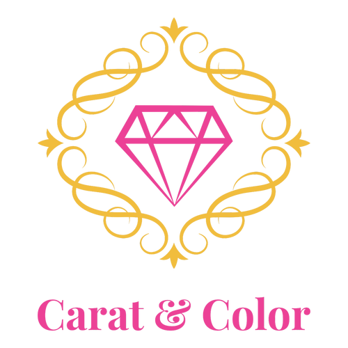
| The traditional European inspiration of the Playfair Display typeface complements the antique French style of this framed diamond icon, highlighting the romance of receiving a diamond ring. The playful pink and orange color palette contrasts the sophisticated design and hints at affordability. |

| A faceted, heart-shaped diamond alludes to specialty cut diamonds for romantic occasions. The shades of soft orange are soothing and inviting, while navy blue gently points to the business's professionalism. The Caudex typeface has a classic style that complements the diamond icon. |

| The business name shines in the bold, dark letters of the Oswald typeface, conveying a sense of tradition and history. The minimalistic trio of crystals embodies a modern logo design that is enhanced by the complementary beige and black color palette — a sophisticated, contemporary design. |

| Dark purple immediately brands your business as a luxury one, with the trio of diamonds highlighting the business focus. The stars add sparkle and convey a premium brand, while the brush calligraphic style of the Cookie typeface adds a retro, Art Deco effect that ties the design together. |

| Bright red catches the eye and draws attention while also conveying the business's passion for jewels. Combined with the icon of three gems, this logo suggests a jewelry business specializing in quality gemstones, such as rubies. The monolinear Poppins typeface complements this geometric design. |

| The icy white of this design combined with the shattered diamond icon immediately brings to mind the image of light refracting off a perfectly cut diamond. The point of the icon draws the eye to the business name in the geometric Sen typeface, which adds a sensible, professional look to the logo. |

| A bright pink and yellow-orange color palette conveys youthful excitement and happiness, making this design suitable for a business that specializes in delicate diamond jewelry pieces for children — as shown by this stylized diamond ring icon. The Sacramento typeface adds a personal, retro touch. |

| The Federo typeface helps the business name shine with crisp letters that increase legibility both online and in print. This design also stands out due to the use of negative space to hint at a diamond shape, while the magenta and blue rays add dynamic energy symbolic of imagination and luxury. |

| The thick, bold lines of this icon grab attention and create a royal emblematic effect that elevates the business. The dramatic serifs on the Cinzel Decorative typeface complement the over-the-top style of this design, while dark brown grounds the logo with a sense of dependability and resilience. |

| The decorative swirls to either side of the diamond suggest elaborate settings for diamond jewelry and, together with the three stars, indicate high-quality designs. The Poppins typeface is well-spaced and complements this symmetrical logo, and the blue tones symbolize professionalism. |

| Purple is the dominant design feature of this logo and conveys a brand message of luxury, royalty, and creativity. The geometric diamond pattern shows versatility and creativity, while the curves of the Philosopher typeface add visual contrast for an aesthetically pleasing design. |

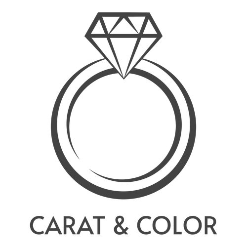
| This minimalistic design uses a contemporary and classic diamond ring icon to indicate a jewelry or wedding planning business. The Alata typeface is a monumental font that celebrates the grandeur and wealth of diamonds, while the use of dark gray adds strength and sophistication to the design. |

| This abstract icon shows a diamond in a metal setting, but has the versatility to be used for a variety of business types. The Josefin Sans typeface offers the perfect vintage geometry to underline the icon with elegance, while violet and gray set the stage for a professional, yet luxurious brand. |

| The Lato typeface has harmonious letters that form an elegant typeface to match the delicate icon. This harmony is continued through the mandala-inspired diamond, which adds a peaceful quality to the design. Soft orange and navy blue contrast warm and cool tones to add a dynamic aesthetic. |


