Clock Logo Ideas:
Logo | Description |
|---|---|

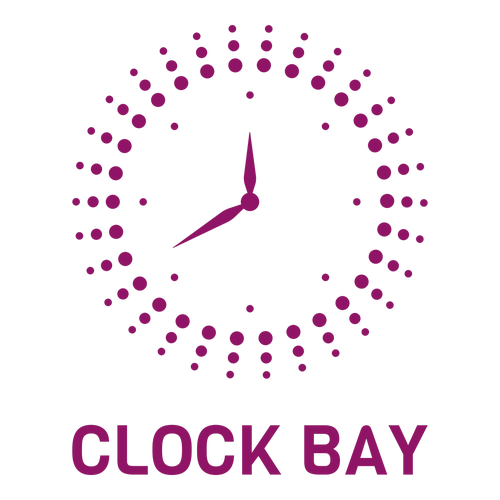
| The captivating star-burst design of this icon creates a sense of excitement. The radiating nature of the image is enhanced by the vibrant shade of magenta, a cheerful and energizing color. The bold strokes and variable edges of the Viga typeface match the dynamism of the design beautifully. |

| The gentle sea green looks calm and gives this design a delicate, harmonious energy. In combination with the heart-shaped clock face and romantic, swirled serifs of the Playfair typeface, this logo gains a distinct "kawaii" quality, which could be enhanced with pastel-colored backgrounds. |

| The neat and crisp strokes of the Lato typeface provide a strong base for the ornate and fanciful icon. The ornamental flourish in the icon is suggestive of luxury, while the black backdrop conveys a sense of authority and provides a fantastic contrast to soft golden-beige icon and lettering. |

| The chunky Fredoka One typeface has an informal, personable, and playful appeal. The typeface tempers the swanky icon of a clock face reposed on gentle, fern-like swirls, whereas the dark pink-reddish color accentuates it. This curious combination creates a sense of lavish, childish thrill. |

| In calm shades of blue, this sunray-inspired clock design makes an elegant and creative impression. The subtle elements in the center neatly add the key features to identify the icon as a clock. The rounded, blocky letterforms of the Orbitron typeface add a chic, futuristic aesthetic. |

| The Cardo typeface has a very strong classical appeal, making it ideal to add a touch of sophistication to your logo. This also pairs well with the warm gray color, which exudes style and elegance. While the clock face in the icon is simple, the framing circular swirl adds a modern, dynamic quality. |

| The fresh green in this logo instantly lifts the mood and imbues it with cheerful vibrancy. The dotted rings draw the eye and enhance the design's lively character, while the clock's blue features add a subtle elegance. The thick-lettered Lato typeface forms a solid base below the airy icon. |

| The neat, even strokes of the Josefin Sans typeface pair well with the linework of the icon. The sharp angles of the clock design are reminiscent of fine gears and suggest intricate mechanisms and precision engineering. Red adds a sense of passion and boldness, elegantly balanced by the soft gray. |

| A flaming clock is an eye-catching design that conveys passion and energy without the use of loud colors. The Miriam Libre typeface has a simple, modern flair that pairs well with the calm, professional appeal of blue and gray. This logo offers a beautiful balance of vigor, modernity, and style. |

| The solid black backdrop is powerful and authoritative and lets the white details of the design stand out crisply. The icon is simple but striking, with the arched stroke adding a sense of motion. The playful terminals of the Sansita typeface add a perky twist, giving the design a charming appeal. |


