Body Butter Logo Ideas:
Logo | Description |
|---|---|

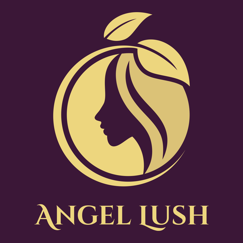
| This elegant design combines a purple backdrop with a muted yellow hue to convey luxury and beauty, pairing well with the vintage feel of the Cinzel typeface. The woman's face and fruit icon suggest that your body butter is made of natural elements and will leave customers with rejuvenated skin. |

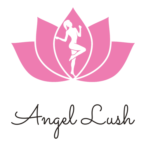
| The lotus symbolizes rebirth, which hints at your body butter's revitalizing properties. The woman emerging from the pink flower looks confident, which is perfect for a brand that's all about making clients feel beautiful. The softness of the Sacramento typeface adds to the femininity of the design. |

| The nighttime theme of this logo is ideal for a brand that creates body butters made to be used before bedtime. The shades of purple and pink denote mystery and whimsy, which may allude to your body butter's magical ingredients. The diamond icon is complemented by the classic Montserrat typeface. |

| Modern and playful, the butterfly icon represents the transformation your body butter will bring customers' skin. The icon's delicate pink linework contrasts well with the black color scheme, which feels professional. The Playfair Display typeface adds an element of sophistication to the logo. |

| The polished floral icon, paired with the Sen typeface, creates a modest design that will suit a body butter business. It tells customers that minimal ingredients and packaging are what your business is all about. The navy blue color scheme is distinct and complements the centered hint of olive. |

| The hot pink backdrop immediately catches the eye, illustrating the sensuality of applying body butter by allowing the woman in the icon to stand out. The Goudy Bookletter 1911 typeface adds a touch of style to the design and pairs well with the sketch-like quality of the icon. |

| The golden, geometric icon is reminiscent of the sun and creates a sense of warmth, which is ideal for a body butter brand that aims to bring a glow of happiness to customers. The elegant Cormorant Garamond typeface feels balanced and adds to the symmetry of the logo's design. |

| This delicate floral icon uses shades of pink with accents of jade to illustrate love and beauty, suggesting that your body butter will make clients feel radiant and special. The handwritten quality of the Sacramento typeface harkens back to a time of romance, which will suit a vintage brand. |

| The regal and professional feel of this design is achieved by the combination of a geometric crown and the classic Sura typeface. The dark green and gold color palette complements the design's modern and sophisticated aesthetic. An ideal choice for a premium brand that uses high-quality ingredients. |

| The green color scheme denotes freshness and will suit an organic body butter brand that favors natural ingredients. The simple linework of the woman's silhouette stretched across the Poppins typeface creates a feeling of balance and harmony — perfect for a body butter that promotes relaxation. |


