Athletic Logo Ideas:
Logo | Description |
|---|---|

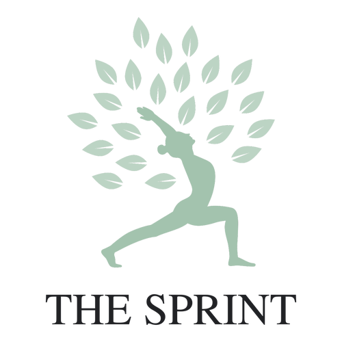
| A posing woman cloaked in floating petals is a brilliant symbol of tranquility and suits a wellness brand or one with a holistic philosophy. The muted blue-gray profile lends seriousness and professionalism to the brand, and the Jomolhari typeface has a sharpness that is attractive and legible. |

| The dark blue color communicates reliability, loyalty, and professionalism, while the Ranchers typeface has exaggerated strokes that mimic muscle growth. The icon of a dumbbell flanked by majestic wings projects speed, mastery, and grace. A gym or fitness center would love this design. |

| Gladiators were the athletes of their time and represent power, honor, and athletic ability. They make great emblems for gyms or fitness centers. Red embodies the passion, intensity, and love for self-improvement, while the Paytone One typeface has a heaviness that grants importance to the business. |

| Brown symbolizes your ties to nature, and the Candal typeface has thick lines that give authority to the brand. The dolphin is streamlined and graceful, qualities that are shared with professional athletes. This logo works for an athletic clothing brand that promises excellent performance. |

| The surfboard that fights against the tide demonstrates the athletic qualities of balance, strength, and discipline, suiting a surf brand. Orange projects the joy of surfing and blue conveys the reliability of your brand. The Paytone One typeface has distinctive curves that mimic waves. |

| Green does well to brand your company as environmentally conscious. The Sen typeface has plenty of space between its letters, creating breathing room that is pleasing to look at. The archer's arrow points upwards and forwards, suiting an athletic brand with progression and evolution at its core. |

| Mountaineering requires various athletic attributes in order to scale godly heights, and this logo encapsulates the feelings of victory and pride associated with athletic achievement. Teal and orange are fun and positive colors, and the Enriqueta typeface has a boldness that inspires confidence. |

| The martial arts practitioner centered in this logo is poised, balanced, and lethal. The shield and wreath around him symbolize security and excellence, and the red color conveys passion, intensity, and action. The Proza Libre typeface has sleek lines that would look great on branding material. |

| The wearer of this shoe is running so fast that the shoe leaves a blurry, unfocused trail behind it. This is a clever symbol for speed and strength and suits an athletic shoe brand. Black imparts a sense of prestige on customers, and the Montserrat typeface has a boldness that supports the shoe. |

| The athleticism of dogs is depicted in this logo and conveys speed, precision, and discipline. These are great qualities to associate with an athletic brand. Yellow-orange is an energizing color that attracts attention, and the Mitr typeface has sleek lines that are as streamlined as the dog. |

| While the Audiowide typeface has dynamic lines that suit a sports brand, the golfer is displaying a fair amount of athleticism with his precise and powerful swing. The swoosh that follows his swing creates a sense of motion that amplifies his fitness, and the dark blue color conveys trust. |

| The lion symbolizes strength, the shield stands for protection, and the wings and stars point to speed and excellence. These elements come together to create a mighty logo for an athletic company. Pink brings lightness and balance to the logo, and the Libre Baskerville typeface is sharp and refined. |

| The teal color communicates optimism, creativity, and enlightenment, and the Jomolhari typeface has sharp serifs that give the brand status and prestige. The elastic figure of a stretching woman conveys notions of hard work, discipline, and athleticism, suiting a yoga center. |

| The leaping deer is an image of power, speed, and beauty. It suits an athletic clothing brand that treats high performance like art. Dark pink and orange pair well and convey intelligence and positivity, while the Cinzel typeface has sharp, chiseled serifs that are as aerodynamic as the animal. |

| Light and dark shades of blue convey idealism and reliability, and the Russo One typeface's bold strokes instill confidence. The surfer is using his physique to navigate the ocean waves, evoking feelings of action, athleticism, and skill. This makes a great logo for a surf shop or surf school. |

| The fluid lines of the figure express dynamism and agility, and its poise is celebratory. This suits an athletic coaching service. Black hints at excellence of service, while green adds freshness to the design. The Philosopher typeface has an elegance and flexibility that mimics the agile athlete. |

| The skateboard and sun icon embodies ideas of boundless freedom, self-expression, and high performance. Navy blue conveys trust and loyalty, while orange evokes positivity and joy. The Righteous typeface has a unique style that is edgy and ballsy, matching the skateboarding culture. |

| Zeus, god of thunder, lightning bolt in hand, is an image of strength, authority, and respect. This closely mirrors the qualities of athleticism. Gray and orange combine professionalism and energy, while the Bungee typeface has an exaggerated boldness that conveys confidence and power. |

| The cute figure of a running boy is both adorable and athletic. This suits an athletic brand for children. The shadow beneath the runner gives him bounce and enhances his athleticism, and the sky blue color represents youthful idealism. The Odibee typeface has a childlike, carefree design. |

| It's rare for a business name to hold the stage in a logo without any supporting icons or colors, but the Ubuntu typeface revels in the spotlight. Its slanted design imparts feelings of dynamism, movement, and action on the viewer, suiting a brand that wants to associate with these qualities. |


