Archery Logo Ideas:
Logo | Description |
|---|---|

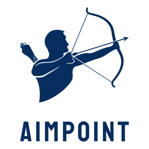
| This on-brand logo exudes strength and power, drawing inspiration from the striking icon of a man holding a bow and arrow. The addition of the innovative and modern Staatliches typeface helps captivate attention, while blue signifies trust and reliability — perfect for a professional archery camp. |

| The circular icon is reminiscent of a viewfinder, while the image of hills and trees suggests that your business operates outdoors. The black and white color palette oozes sophistication and is aptly paired with the classic Saira Condensed typeface. A great choice for a target archery business. |

| The sleek profile of the woman in the icon is gently glancing downwards, instantly drawing attention to the business name. The Jomolhari typeface, a script initially created for traditional Buddhist texts, highlights prestige and wisdom, traits that are enhanced by the beige and black colors. |

| The crossed arrows draw attention to and accentuate the image of the stag, which symbolizes stamina and virility. The elegant Josefin Sans typeface takes control of the space, while the dark blue-black color implies luxury and serves as a professional backdrop to the white design. |

| The powerful icon is reminiscent of a gladiator in battle and has a commanding presence. Blue signifies intuition, confidence, and stability, traits common to professional archers. The classic Noto Serif typeface adds the perfect final touch, thanks to its structured letterforms. |

| The dark square as a backdrop cleverly emphasizes the apt icon of a figure holding a bow and arrow. The addition of the Staatlitches typeface pairs well with the solid structure of the imagery, thanks to its clean-cut design. Black enhances the strong design and symbolizes trust and authority. |

| The large arrow icon is a creative, abstract reference to archery that will help a business to stand out. The color red exudes confidence and the black addition to the icon creates a dynamic element that indicates motion. The bold KoHo typeface suits the icon and looks modern and sleek. |

| A modern design that will look great on promotional material. The hexagon-shaped icon cleverly incorporates the tip of an arrow, evoking the image of an arrow moving through the air. The classic Cardo typeface pairs well with the color blue, which often represents confidence and trust. |

| The red and black palette creates a striking contrast, instantly drawing attention to the icon of a man holding a bow and arrow. While red is great for a call to action, it also emits passion and strength, traits found in trained athletes. The strong Saira Condensed typeface adds some finesse. |

| This is a timeless logo that will pair well with branding material, including archery equipment. The elegant monochrome color palette radiates wisdom and sophistication, characteristics accentuated by the simple Jomolhari typeface. The absence of an icon also leaves room for brand expansion. |


